Trilingual Product Designer
Product Redesign
Transforming Problems into Solutions with Human-Centered Design
Focus
Goal
User Needs / Business Goal / Feasibility Check
Building better products that drive business growth.
You’ve probably seen countless portfolios by now. Many either:
overload you with unnecessary details, or
show the final design without the thinking behind it.
Let’s be real—no one has time to go through every single detail. What matters is how it applies elsewhere.
A good portfolio, like good communication in a cross-functional team, should be clear, concise, and easy for anyone to understand—not just designers.
Agile isn’t just a buzzword; it’s about finding what works best for your team, fast.
So, I’m keeping it simple. In this case study, I’ll focus on what truly matters—how to build better products that drive business growth.
No fluff. No BS.
Turning User Pain Point into Business Success
When redesigning a product, we should start by identifying what frustrates users. If multiple users mention the same problem, it’s a clear sign it needs attention. Fixing these pain points will make our users happier and benefit the business.
image 1:
The full online enrollment flow before the redesign.

Pain Point #1
Users found it difficult to navigate through the steps in Image 1. The back button was too far down, requiring extra scrolling and clicks, especially on longer pages. See Image 2 for an example.

image 2:
Users can't find how to go back to the previous step. The back button also doesn’t say 'Back'—it shows the previous step’s title instead, which can be confusing.
Discovering What Users Need
The main issue was users couldn’t move freely through the Online Enrollment steps and needed an easier way to navigate.
The first improvement was adding a progress bar to the online enrollment flow (See Image 3).
Why it helps:
-
See all steps: Users get a clear overview.
-
Move easily: Jump to any step without back and forward buttons.
-
Track progress: Know what’s done and what’s left.


image 3:
Progress Bar Detail
image 4:
Example of where the progress bar is.
Pain Point #2
Users are given four options, but there’s not enough information to help them decide.

image 5:
Users are frustrated because they don’t know what to choose, as there is no helpful information about the options.
Also, the highlighted information in image 6 feels buried under the 'Other' option.
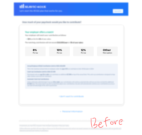
image 6:
Important info was missed because it only appeared under 'Other' option, leading to confusion and more support emails.
Understanding Business Goal
Before designing, it is important to understand the business goal.
I learned that the preset options (8%, 10%, 12%) started as 6%, 8%, and 10%, then changed to 10%, 12%, and 14%, and finally settled on 8%, 10%, and 12%.
The business goal is to encourage users to choose the highest contribution percentage.


image 7:
New design

What’s changed in the new design, and why?
-
Used symbols (rocket, plane, paper plane) to represent each rate.
→ Helps users spot the recommended option faster. -
Rearranged the preset deferral rates (highest on the left, lowest on the right).
→ Because users read left to right, so the highest rate stands out first.
-
Added a ‘Learn More’ button for extra info.
→ Gives users helpful guidance, and the marketing page was already there.
-
Made hidden info under ‘Other’ option always visible.
→ Important details should be easy to find.

image 8:
A popup modal shows key information at the right time, so users have the details they need before making a financial decision.
Feasibility check: Collaborating with Developers
In product design, there’s rarely a perfect solution—just better ones. That’s why presenting 2-3 options helps improve quality and makes collaboration with developers smoother.
How I communicate with developers:
"I designed two options. Option B is better for users, but Option A is easier to build. Do you think Option B is doable, or should we start with Option A and improve later?"
Option A:
Display Generic Information for All Users
Pros: Simple. Same content for everyone. Easy to build.
Cons: Overwhelming. Users may see unnecessary info. Too much irrelevant content can be distracting.

image 9: Option A
Option B:
Detect User Type and Display Dynamic Information
Pros: Faster decisions. Personalized content keeps users engaged. Clear info helps users choose quickly.
Cons: Extra effort. Categorizing users takes time. May requires regular content updates.

image 10: Option B
We chose Option B because its benefits clearly outweighed Option A. The decision was made collaboratively as a team.
Asking for feedback shows you value their input, making collaboration easier and more effective.
Finishing Thoughts
Know your limits—you don’t have to be great at everything. That’s why teamwork matters. The best products come from collaboration, so don’t do it all alone. Involve your team and build something better together.